
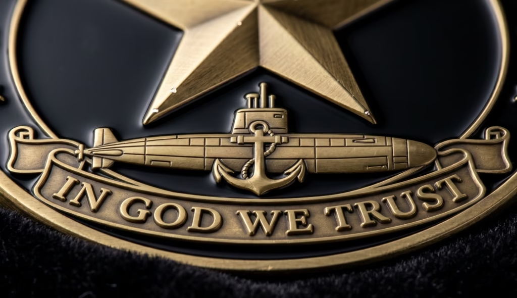
Most people designing their first unit coin make the same move. They start a list of everything that should go on it. The crest, the motto, the deployment, the dates, the nicknames, the mascot, the names of everyone who was there. Then they hand that list to a designer and ask to fit it all on a two-inch disc.
We’ve watched it happen for twenty years. The coins that actually get carried in a pocket for a decade, the ones that end up in a shadow box instead of a junk drawer, almost never came from that list. They came from a few good decisions made early: what your branch’s symbols actually mean, which side of the coin does which job, and what a steel die can and can’t pull off.
This is a guide to making those decisions well. Not a gallery to scroll through, and not a sales pitch. Just what we’ve learned about turning a unit’s identity into something people are proud to hand each other.
What Actually Goes on a Unit Coin
A coin has to say who you are before anyone reads a single word on it. That’s the job of the imagery. Someone should glance at it and know the branch, and ideally the kind of unit, in about a second. But the military’s visual language isn’t one language. Each branch has its own, and the fastest way to mark a coin as an outsider’s work is to get that language wrong.
Speak your branch’s dialect
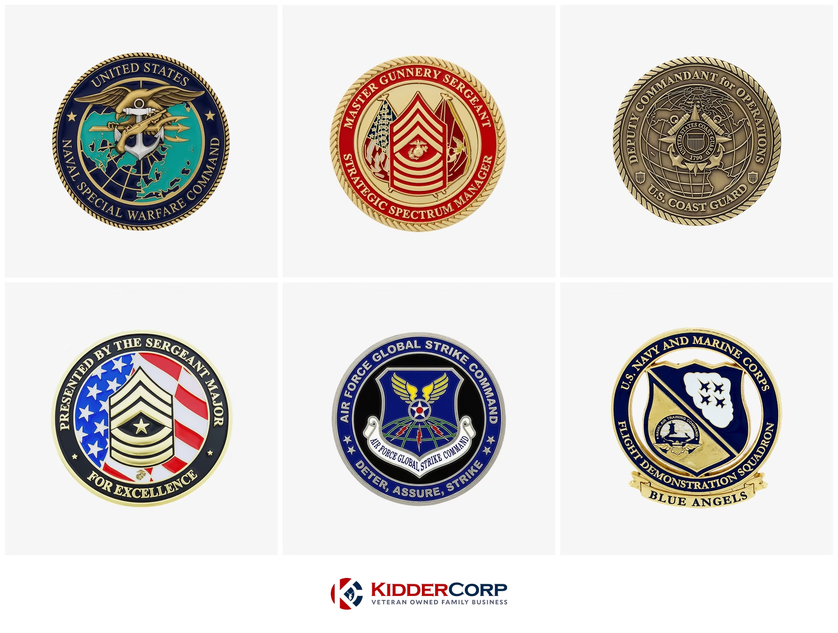
Army. Army coins lean on lineage. Unit crests, regimental insignia, crossed sabers, and the mottos that ride with them, like the Corps of Engineers with their castles and Essayons. The front usually carries the formal command crest. The back is where deployments live, often as a map or the outline of a country with the operation name and dates. Elite units go the opposite way and use symbols only the people inside would recognize, which turns the coin into a quiet badge instead of a public one.
Navy and Coast Guard. Both pull from the sea, but they aren’t interchangeable. Navy designs run on fouled anchors, ships’ wheels, tridents, and ship silhouettes, and on a ship coin the hull number is the whole point. The Chief’s Mess has its own world: the fouled anchor, the goat, the Goat Locker references that mean everything to a chief and nothing to anyone else. The Coast Guard has one element you can’t fake, and that’s the racing stripe. It runs at a specific angle in specific colors, and Coasties know it on sight. Get the angle or the orange wrong and the coin reads as fake immediately. Pair it with Semper Paratus, a cutter, or the Barque Eagle and you’re speaking the language.
Air Force and Marines. These two are opposite kinds of strict. For an aviation unit, the aircraft has to be right. Wing sweep, tail, aspect ratio. Aircrew will spot a wrong silhouette across a room and never quite trust the rest of the coin after that. Fighter squadrons tend toward aggressive, predatory imagery. Airlift and mobility lean on routes and reach. Security forces lean on shields. The Marine Corps is strict in a different way. The Eagle, Globe, and Anchor is sacred, and there’s no creative license with it. The eagle’s stance, the anchor’s set, the globe’s orientation all follow the established form, or Marines notice. Add MARPAT texture, Semper Fidelis, and the unit’s birthday, and you’re on solid ground.
Decide what each side is for
The two faces of a coin aren’t equal, and the best designs treat them as two different jobs.
The front is the resume. Official crest, unit designation, the primary motto, clean and symmetrical. It’s the side that faces up in a presentation box, the side a commander wants when the coin stands in for the unit formally. It should look like authority.
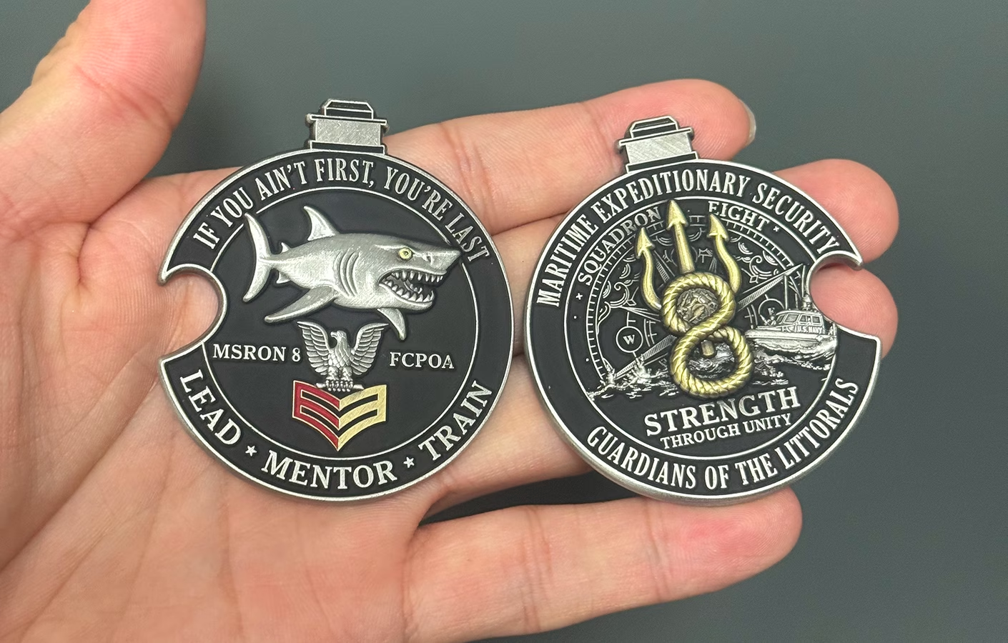
The back belongs to the people who carry it. This is where the deployment map goes, the inside joke, the unofficial mascot, the line that only lands if you were there. Plenty of legendary unit coins have a perfectly squared-away front and a back that would make a sergeant major raise an eyebrow, and that’s exactly why people keep them. The front earns the command’s approval. The back earns the troops’.
Designing with that split in mind settles a lot of arguments before they start. When someone wants to add one more thing, the question gets simple. Is this a front thing or a back thing? Usually that tells you where it goes, or whether it belongs at all.
Turning Your Unit’s Identity Into a Design
The strongest coins don’t start with art. They start with a sentence about who the unit is. Once you can say that out loud, the design tends to fall into place.
Start with the story, not the logo
Before anyone draws anything, get clear on what makes the unit this unit. The mission is part of it, but so is the culture. Look for the things an outsider wouldn’t know to include:
- The mascot people actually use, not the official one
- The phrase that gets said before every mission
- The quiet point of pride nobody outside would understand
- The deployment or moment that defined the group
That material is the coin. A crest pulled off a letterhead is just decoration. The specific, slightly inside stuff is what makes someone hold onto the coin for years.
A good way to find it is to ask the people in the unit what they’d want on it, then listen for what comes up more than once. The repeated answers are your design. The one-off requests usually belong on the back, if they belong anywhere.
Give the design room to breathe
This is the hardest lesson for first-time designers, and it’s the one that separates a coin that looks sharp from one that looks busy. You do not have to fill every millimeter. Empty metal is not wasted space. It’s the thing that lets the main image carry weight.
When a design tries to say everything, it ends up saying nothing clearly. The eye has nowhere to land. The fix is almost always subtraction. Pick the one symbol that matters most and let it dominate. Strip the background clutter off your mascot and focus on the figure. Move the secondary details to the back. A coin with one strong idea and some quiet space around it will always beat a coin crammed with six competing ones.
If you find yourself shrinking text to make everything fit, that’s the signal. You don’t have a sizing problem. You have too much on the coin.
Design Choices That Change How a Coin Feels
A coin is a physical object, and the physical choices shape how the design reads in the hand. None of this is about spending more. It’s about matching the build to the idea.
Size and shape
Bigger isn’t automatically better, but smaller does limit you. A compact coin suits a clean, single-symbol design. The moment you want a detailed crest, fine text, or a deployment map, you need the room. Most unit coins land in the standard size range for a reason. It carries in a pocket and still has space for real detail.
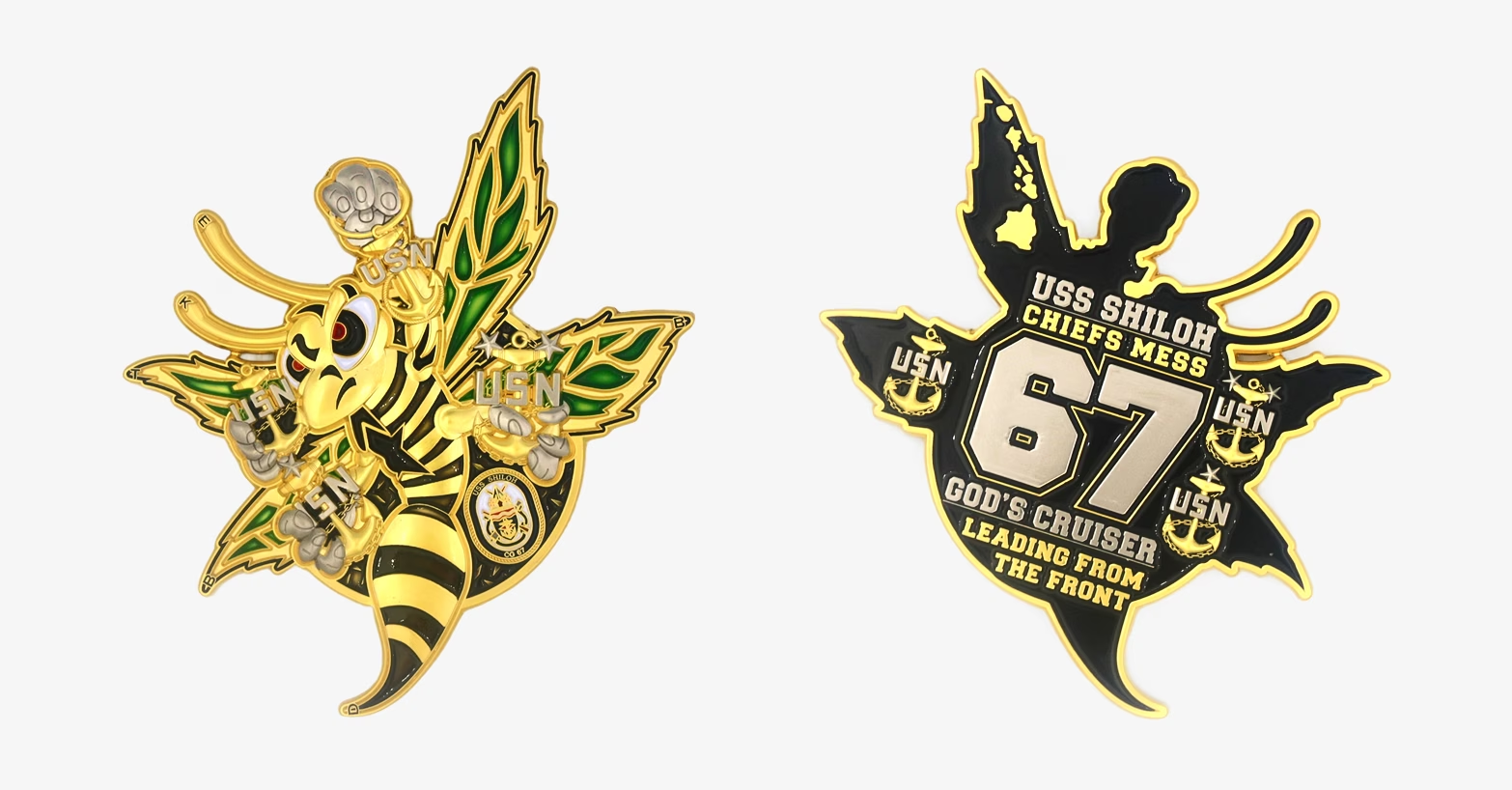
Shape is its own design decision. A round coin is classic and reads as formal. A coin cut to the outline of an aircraft, a shield, a state, or a unit symbol makes a stronger first impression and instantly signals what the unit is about. A cut shape costs you nothing in clarity if the silhouette is recognizable, and it can be the single best idea on the whole coin.
Flat color or sculpted relief

There are two fundamentally different looks, and they’re good at different things.
Flat, enameled design is built for crisp logos, multiple colors, and clean text. If your coin is about a unit crest with several colors and readable lettering, this is the route. The colors sit in recessed metal and the raised metal lines hold everything separate.
Sculpted 3D relief is built for form. Faces, animals, aircraft curves, terrain, anything where you want the shape itself to be the art. A 3D eagle or a sculpted mountain range has a depth that flat color can’t touch. The tradeoff is that sculpted areas don’t hold color the way flat recesses do, so a 3D coin leans on the metal itself to carry the design. Plenty of coins combine both. A sculpted centerpiece with a flat, colored border is a common and effective mix.
Finish and color
The plating finish does more than set the color. It controls how readable the coin is.
Antique finishes, where the recesses are darkened to make the raised detail stand out, are the workhorse for detailed or text-heavy coins. The shadows make small lettering and fine lines pop, and they don’t throw glare. High-polish gold and silver look stunning in a presentation box, but they’re reflective, and they show fingerprints and pocket wear fast. For a coin meant to be carried and handled, antique tends to age better. Black nickel gives a subdued, tactical look that suits law enforcement and special operations work.
On color, soft and hard enamel give you two textures. Soft enamel sits slightly below the metal lines, so you can feel the design with your thumb. Hard enamel is polished flat and smooth, with a more premium, finished feel. There’s also a translucent technique where colored enamel sits over textured metal so the metal shimmers through, which is striking for water, sky, or stained-glass effects. For a fuller breakdown, see our guide on soft enamel vs. hard enamel.
Edges, cutouts, and the extras
The edge of the coin is design space most people ignore. Beyond a plain edge, you can run a rope, diamond cut, or reeded pattern that adds grip and a little visual catch. You can also engrave the edge with sequential numbering or a short phrase, which makes every coin slightly unique and is a favorite for limited runs.
A few other moves worth knowing about. Cutting clean through the metal to create negative space adds real depth and can make a central figure look like it’s leaping off the coin. Glow-in-the-dark enamel is a genuinely fun touch for the right unit. Spinning center elements and built-in bottle openers turn the coin into something people play with, which is half the point of a coin people actually keep. Use these when they fit the unit’s personality, not just because they’re available. One well-chosen feature beats three gimmicks.
The Mistakes That Sink a Good Idea
Most design failures aren’t about taste. They’re about asking metal to do something it can’t.
Crowding and unreadable text
A logo and a paragraph of text that look fine on a big screen can fuse into an illegible blur once they’re pressed onto a small coin. As a rule of thumb, very small text fills in and stops being readable, and thin lines can collapse during the strike. If your design depends on tiny type or hair-thin detail to work, it won’t survive the trip from screen to metal. Build the design so the important elements are large and bold enough to read at arm’s length, and let the proof at actual size be the test.
Why gradients don’t work
This one surprises people. A smooth color fade, the kind where blue blends seamlessly into lighter blue, can’t be produced on a traditional struck coin. Each color needs a raised metal wall to hold it in place, so colors live in separate compartments rather than blending. If a design truly depends on photographic shading or a seamless gradient, it has to be printed and sealed under a clear dome instead of struck, and that trades away the metallic, tactile feel that makes a coin a coin. For most unit coins, the better answer is to design with distinct colors from the start.
The Part People Forget: What You’re Allowed to Use
This is the section most guides skip, and it’s the one that can actually stop a project cold. Being in the military does not give you free rein to put any military imagery on a custom coin.
The key distinction is between official seals and service marks. The official seals of the Department of Defense and the individual branches are protected and reserved for official government use. They are not for custom morale coins, unit fundraisers, or commemorative pieces. Service marks, which include things like unit crests, branch logos, and the Eagle, Globe, and Anchor, can be used on custom items, but they come with rules and licensing requirements that vary by branch, and the Marine Corps guards the EGA especially closely.
The practical takeaway for a unit leader is simple. Know the difference, and work with a maker who knows the landscape and will flag a problem before it becomes one rather than after the coins are struck. A good manufacturer should be steering you away from anything that puts the project at risk.
The same caution applies to borrowed art. Putting a Disney character, a Marvel superhero, or an NFL logo in tactical gear on a coin is popular in underground unit culture, and it’s also a fast way to get artwork rejected. That imagery belongs to large companies that protect it, and a reputable maker won’t reproduce it. If you want that energy, the move is to commission original art inspired by the spirit of the idea rather than copying the protected version of it.
From Rough Idea to Finished Coin
One last thing, because it stops a lot of people before they start. You do not need finished artwork to begin.
A napkin sketch, a photo of a unit patch, a couple of reference images, and a few sentences about what you want is plenty. The art team’s whole job is to turn that into a proper proof. You’ll see the design at large scale to check spelling, color, and detail, and at actual coin size to judge how it really reads, and you revise from there until it’s right. The polished vector file is the end of the process, not the price of entry.
The thing to protect along the way is the idea. If the concept is honest to the unit, if each side is doing its job, and if the design has room to breathe, the coin will land. Everything else is craft, and craft is the part we handle.
KidderCorp has been designing custom challenge coins for military units, law enforcement, and first responders since 2005. We’re veteran-owned, our design and revisions are free, and we never charge artwork fees. Bring us a rough idea and we’ll help you turn it into a coin your people will carry for years.


